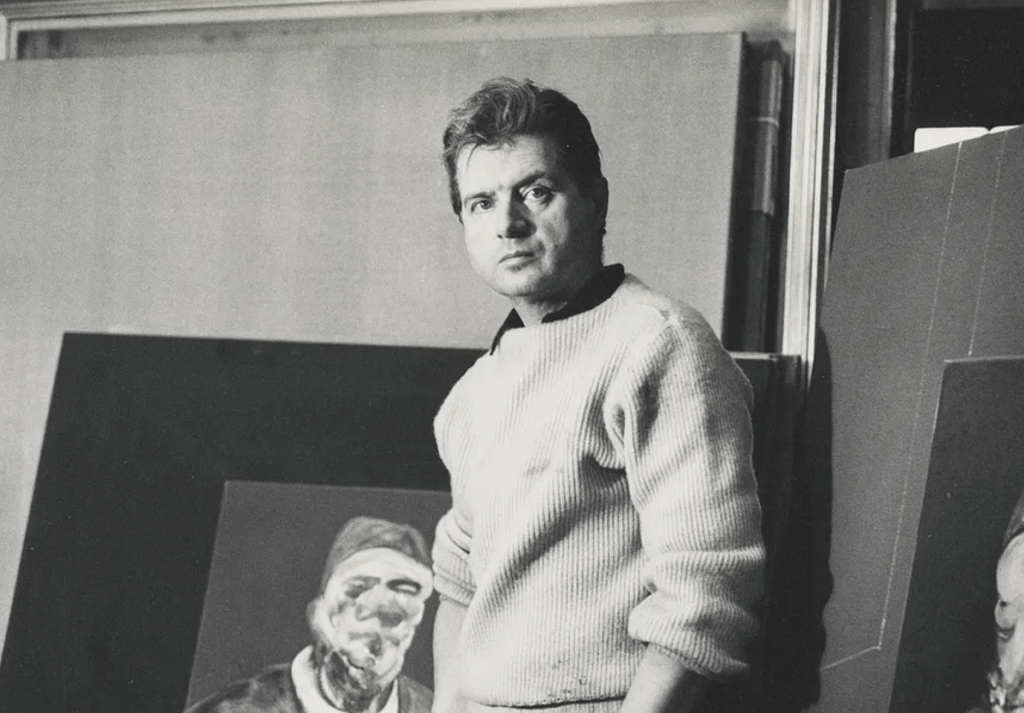
“All painting is an accident. But it’s also not an accident, because one must select what part of the accident one chooses to preserve.”
-Francis Bacon
Initial Data Exploration
The first part of any data analysis project is data collection. In order to capture Francis Bacon’s 500+ paintings to start my analysis, I needed to find a reliable source- thankfully, all of the artist’s known works are recorded in a ‘Catalogue Raisonné’ found on the Francis Bacon estate’s website. The paintings are grouped by decade and each artwork comes with related details including the title, CR code (a unique painting identifier), painting dimensions, as well as the materials used to create it. There is other additional information that varies from painting to painting.
The format of the webpage that displays each painting is regular and consistent- an image of the painting at the top of the website, followed by title etc. Although this provided an opportunity to automatically cycle through each page and retrieve the necessary information (a technique called web-scraping), I decided not to do this for the initial exploration because I wanted to see as many individual paintings as I could firsthand.
For the initial data exploration, I recorded as much data as possible for the first 200 paintings of Bacon’s career in an Excel spreadsheet and used a free-to-use data visualisation tool called Flourish to produce the following plots.
Visualising the data
The bar chart above shows the number of paintings Bacon painted each year for the first 200 artworks he produced. We can see that there are two distinct periods of his career: the early period (1929 to 1936) where only 15 paintings are catalogued, and the ‘start’ of Bacon’s artistic career from 1944 onwards.
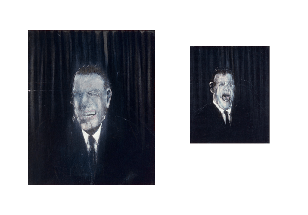
Bacon used to insist that his professional artistic career began in 1944, it is well known that he was painting much earlier than that. His first known paintings, ‘Watercolour’ and ‘Gouache’, were created during this early period and were directly inspired by Pablo Picasso whose style is very apparent in these works. Bacon adopts Pablo’s signature abstract shapes combined with flat, muted colours- something starkly different to the more vivid and bold art seen later in Francis’ career.
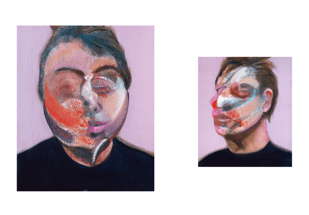
‘Watercolour’, 1929
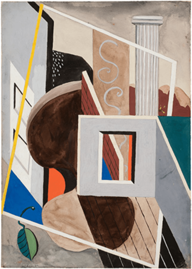
‘Gouache’, 1929
Between these two periods of Bacon’s early career there is an 8 year gap from 1936 to 1944 where Bacon seemingly produces no paintings. The reason for this is unknown but Bacon’s reputation for destroying his own works, as well as the start of WW2, may have been the cause of this inactivity.
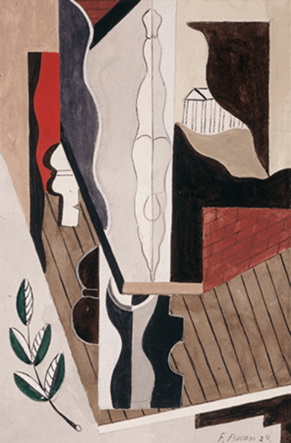
There is evidence that Bacon was producing and destroying much of his earlier artworks. A 1932 painting by fellow artist and admirer Roy de Maistre gives a glimpse of Francis Bacon’s studio and shows the faces of unknown paintings by Bacon stacked on top of one another.
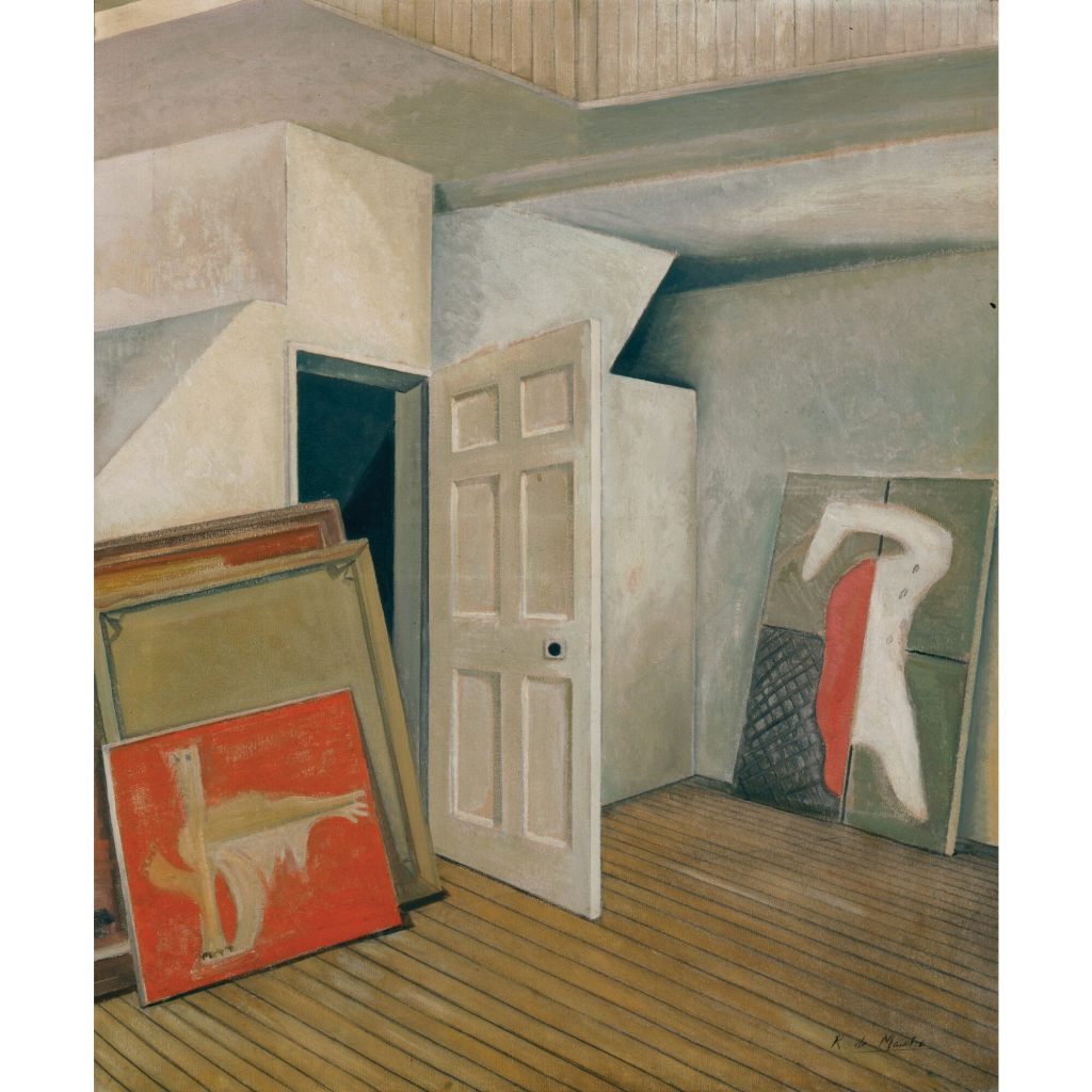
Roy de Maistre (1894-1968), ‘Francis Bacon’s studio’, 1932
The dynamic scatter plot above shows how the size of Bacon’s paintings changed over time. The average size of a Bacon painting (based on the first 200 he created) is approximately 1.4 m by 1 m (in the art world, the height dimension comes before the width). We can see that the majority of his early paintings from 1929 to 1944 were below this average size, but later on in his career he begins to use larger canvases- the largest being 2.02m × 1.42m.
It is also interesting to see clustering around the 0.6m × 0.5m, 1.2m × 1.5m and 2m × 1.4m sizes showing that Bacon had preferences (or was commissioned) to use a particular sized canvas. In addition to this, we can also see from the plot that Bacon preferred portrait paintings over landscape. Only 4 of the 200 paintings shown in the scatter plot are landscape paintings where the width of the painting is greater than the height.
The reason why I felt recording the dimensions of the paintings was important was because I wanted to explore whether the size of the painting affected the auction price. However, retrieving auction price information of paintings is difficult, firstly because a lot of these paintings were sold in private and so the price the painting sold for is not publicly disclosed. Secondly, because many of Bacon’s paintings were sold or donated decades ago and so auction price information is simply not there.
From the data available, I was also able to visualise common materials Bacon used for his paintings in a heat map. The painting base (y axis) is the material Bacon painted onto and the drawing material (x axis) is the material he used to paint with. The deep red colour of the canvas and oil box shows that Bacon had a clear preference for this combination, being used in 181 paintings out of the 200. The second most common pairing was sand and canvas. Although sand might seem like an unusual material to paint with at first, some digging revealed that Bacon used sand to create more texture to the paint- he wasn’t using sand to paint with, rather combining it with paint to enhance the image.
The final visualisation I created was one of the current ownership of the paintings. The majority of the paintings are currently owned by anonymous private entities but there are some renowned institutions, such as the Tate gallery in the UK and Museum of Modern Art in New York, that own a few of Bacon’s works. An interesting discovery was that the the Sainsbury Centre for Visual Arts in Norwich holds the largest collection of Bacon’s paintings by a single known entity with 8 artworks.
This initial data exploration was not meant to be an in depth analysis. Instead, the aim was to give me a better understanding of what I was dealing with and how I can use the information in the future for more complex investigation. As expected, the data acted like a window through which I could see glimpses of Bacon’s life and mind, and has only motivated me even more to study his paintings at a deeper level, and try to answer questions like: Why are his paintings are so powerful? Is there a method to the madness seen in his art? How are the prices for his paintings justified?